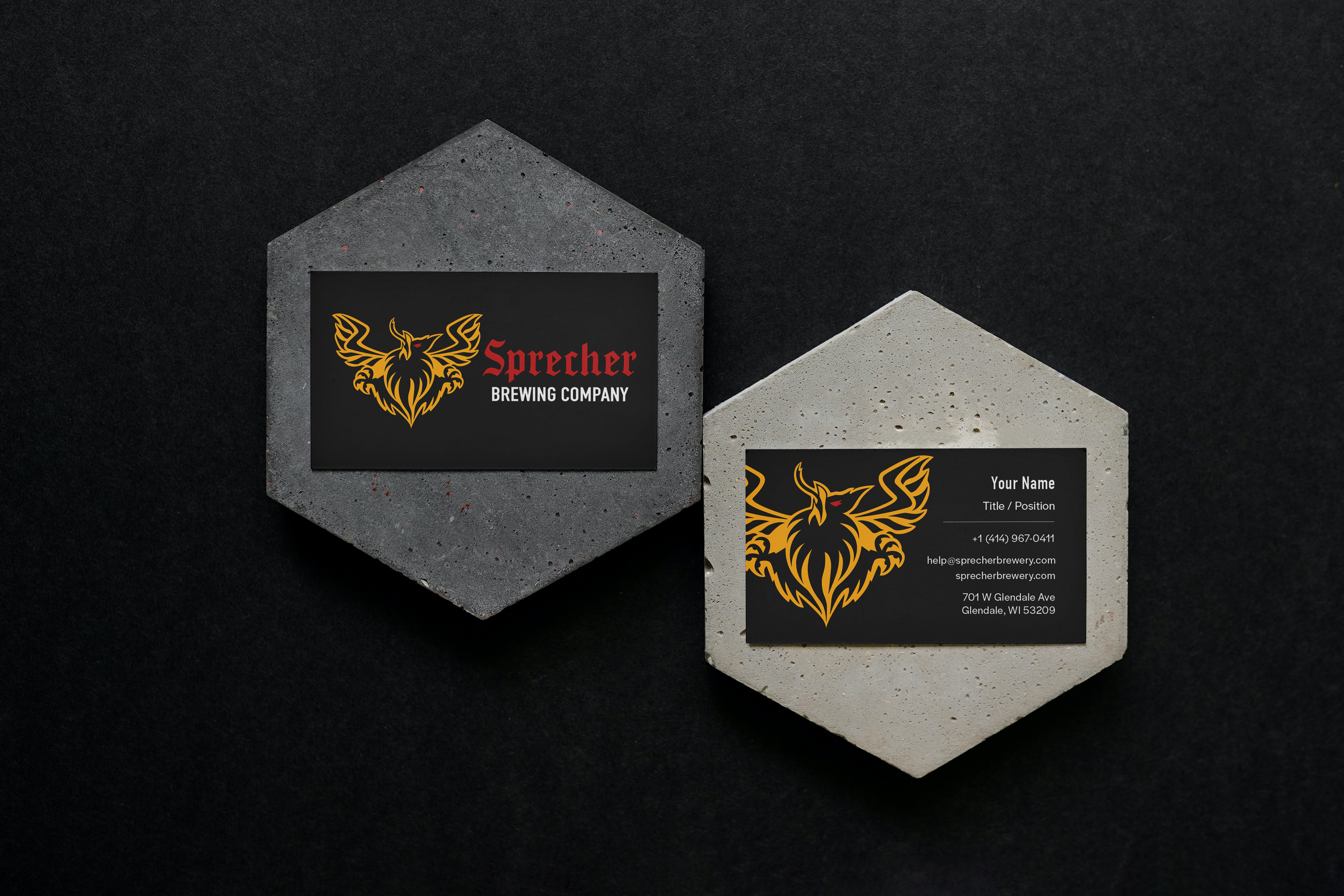
Brandmark
Horizontal Logo
Vertical Logo
Wordmark
Objective:
You will select a Milwaukee-based business (Sprecher Brewing Company) and assign it a new archetype (Creator --> Outlaw) , creating a comprehensive brand identity kit.
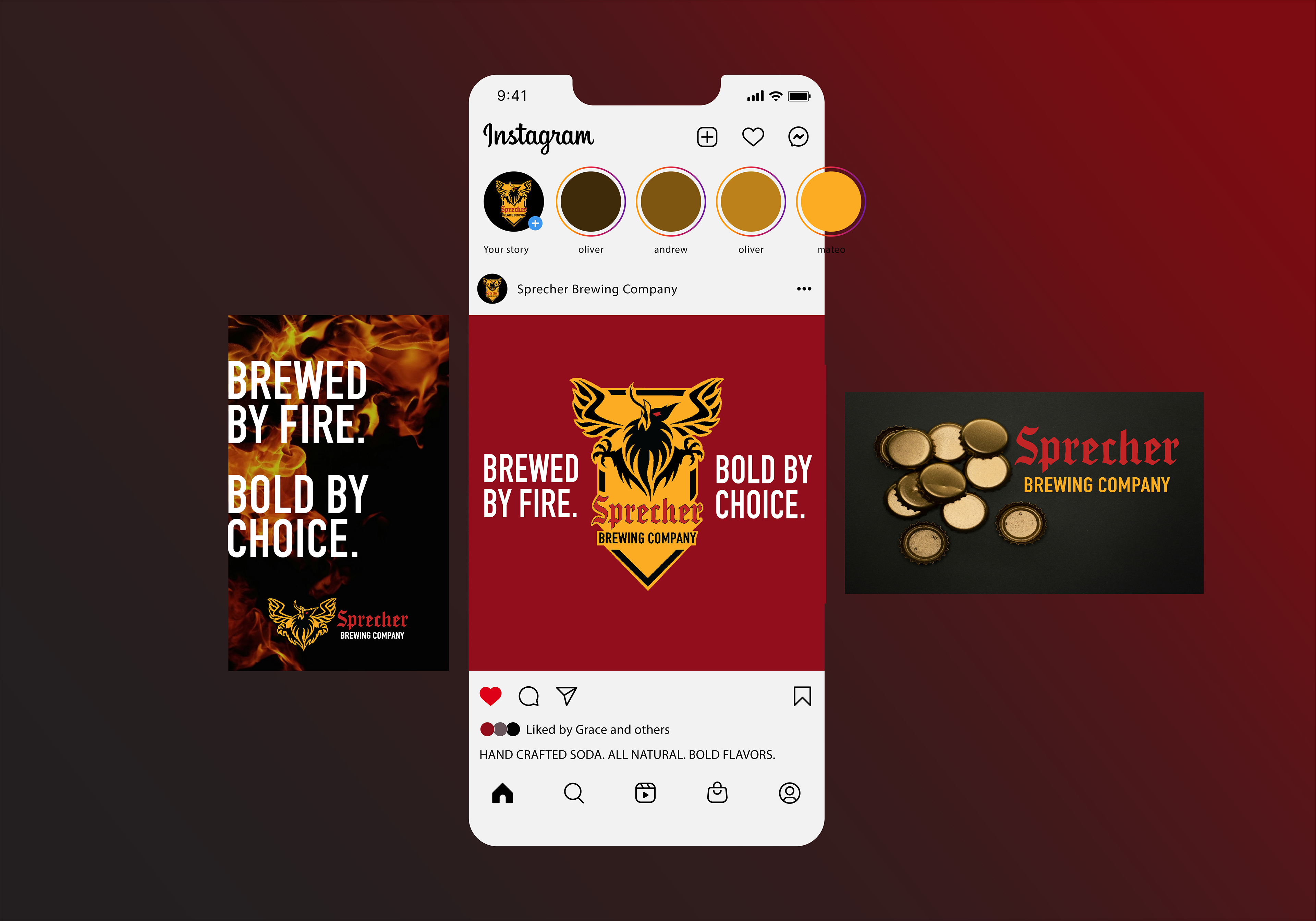
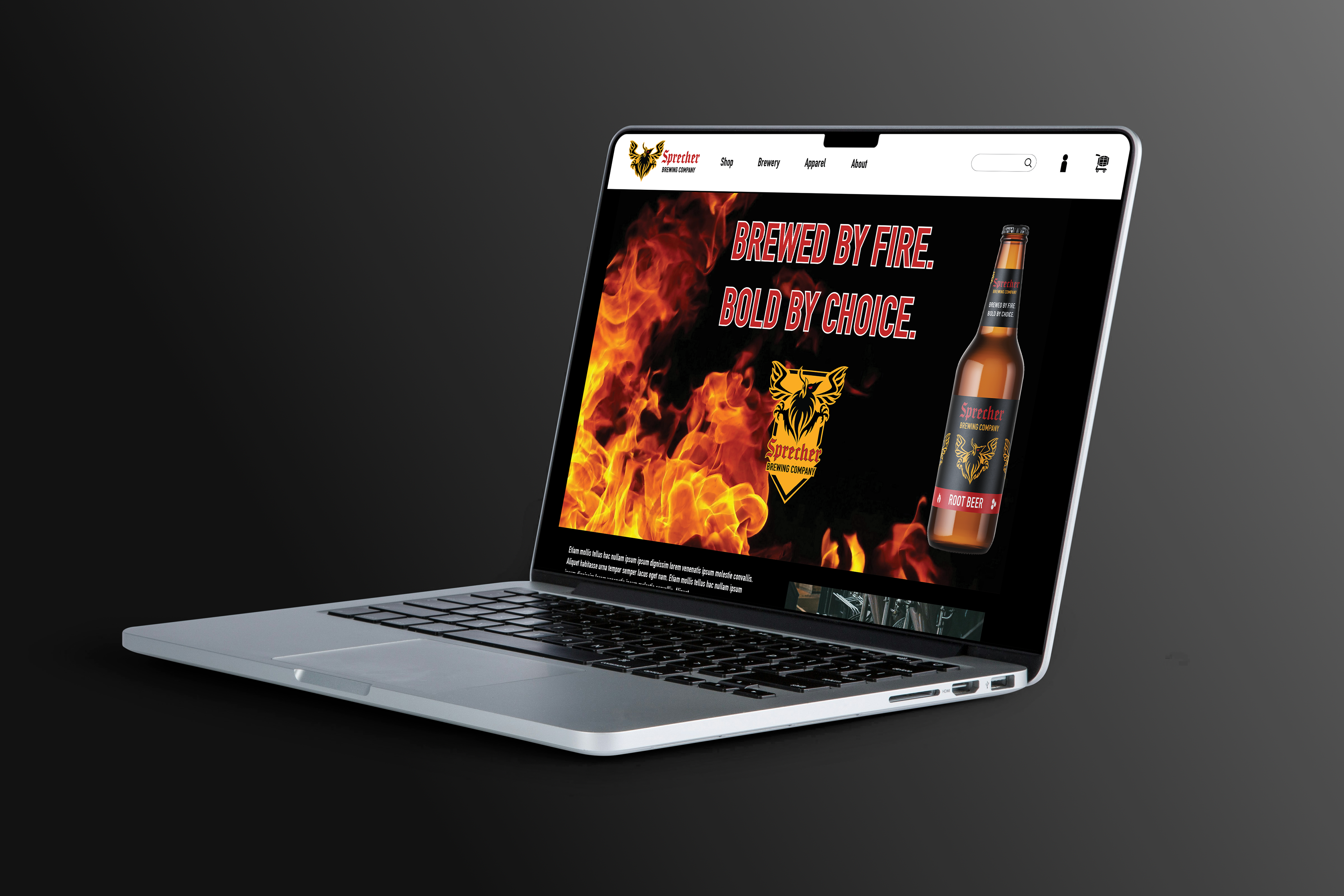
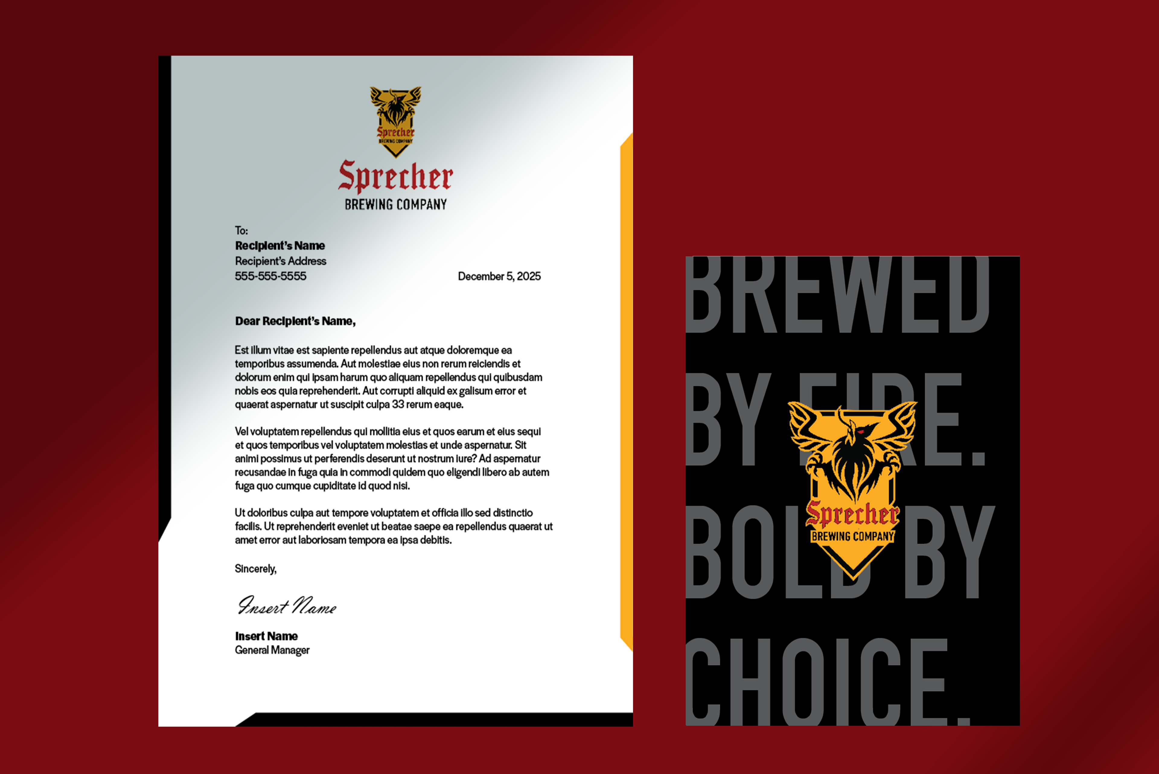
Deliverables will include logos, color palette, typography, and applications across different platforms, culminating in a cohesive brand system.
Rationale:
Redesigning the logo to better suit the brand’s new identity was a challenging process, but
ultimately I was able to balance heritage with modernity, ensuring the design feels both
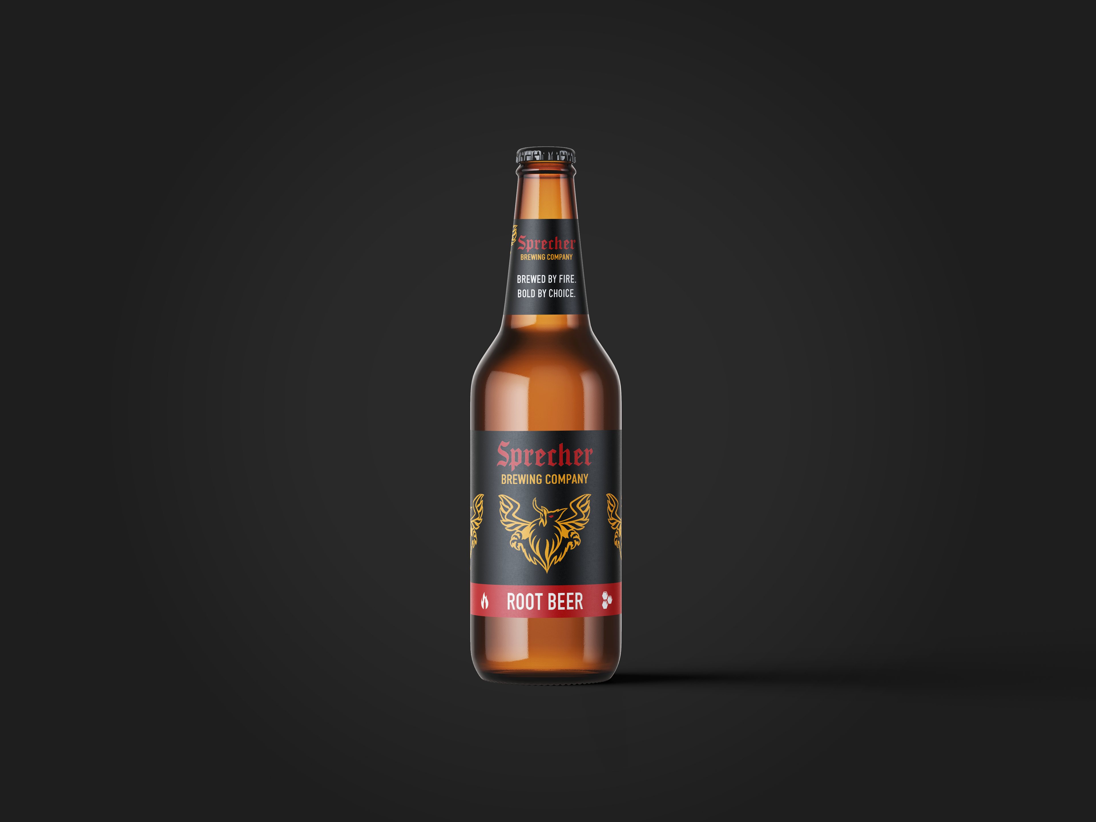
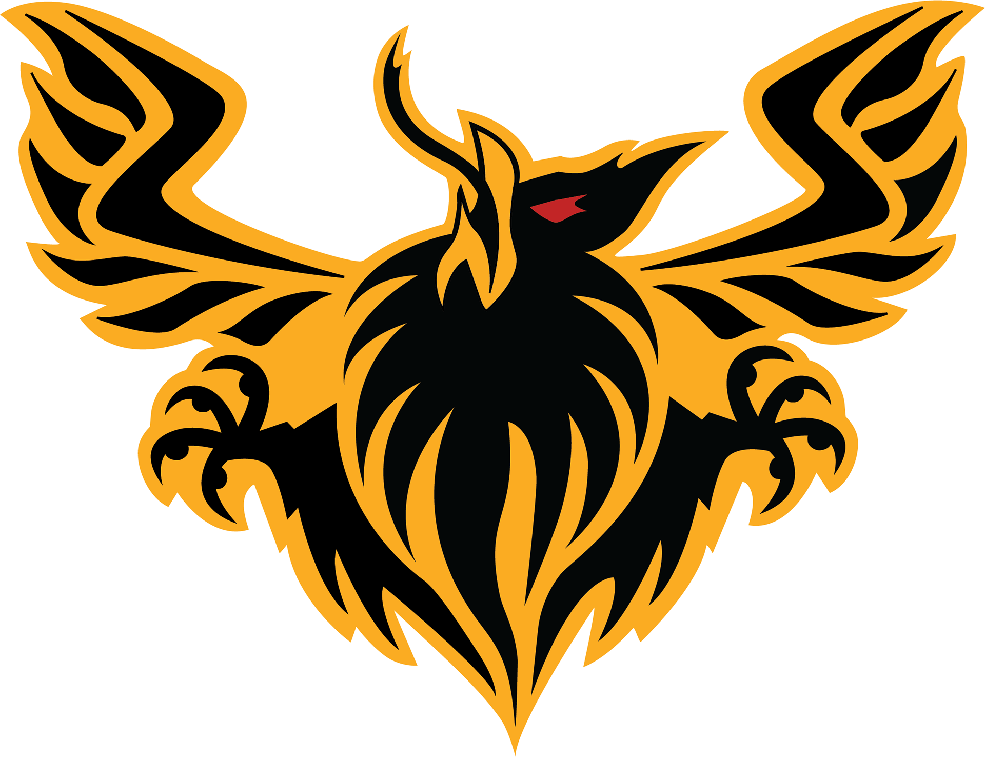
timeless and adaptable. Through different iterations, I refined shapes within the broken shield and griffin, typography, and symbolism until they spoke with clarity and cohesion.
ultimately I was able to balance heritage with modernity, ensuring the design feels both
timeless and adaptable. Through different iterations, I refined shapes within the broken shield and griffin, typography, and symbolism until they spoke with clarity and cohesion.
The final logo not only strengthens the brand recognition but also embodies the values set
out to express boldness, authenticity, rebellion, and freedom. The angle at which the griffin
is portrayed is seen in a high position profile, signifying its boldness. The authenticity comes from the design elements, showcasing the brand’s heritage in color and imagery, integrity in the shape of the shield, and the tone spoken within the typography which aligns with how the brand speaks and behaves in the world. This logo also signifies our rebellious traits, breaking away from convention to independence, grit, and defiance. Lastly, the expansive design layout helps create space and defies restrictiveness, allowing for freedom to be expressed in every aspect.
out to express boldness, authenticity, rebellion, and freedom. The angle at which the griffin
is portrayed is seen in a high position profile, signifying its boldness. The authenticity comes from the design elements, showcasing the brand’s heritage in color and imagery, integrity in the shape of the shield, and the tone spoken within the typography which aligns with how the brand speaks and behaves in the world. This logo also signifies our rebellious traits, breaking away from convention to independence, grit, and defiance. Lastly, the expansive design layout helps create space and defies restrictiveness, allowing for freedom to be expressed in every aspect.
The logo redesign marks a pivotal step in clarifying the brand’s new identity. By distilling core values in bold, cohesive iterations, the new design balances authenticity with adaptability, honoring the past while embracing the future. In short, this redesign ensures the brand speaks with clarity, confidence, and distinction across every channel.