Objective:
This project will demand that you think about the nuances of place making as well as the subtleties/intricacies of typographic form.
Rationale:
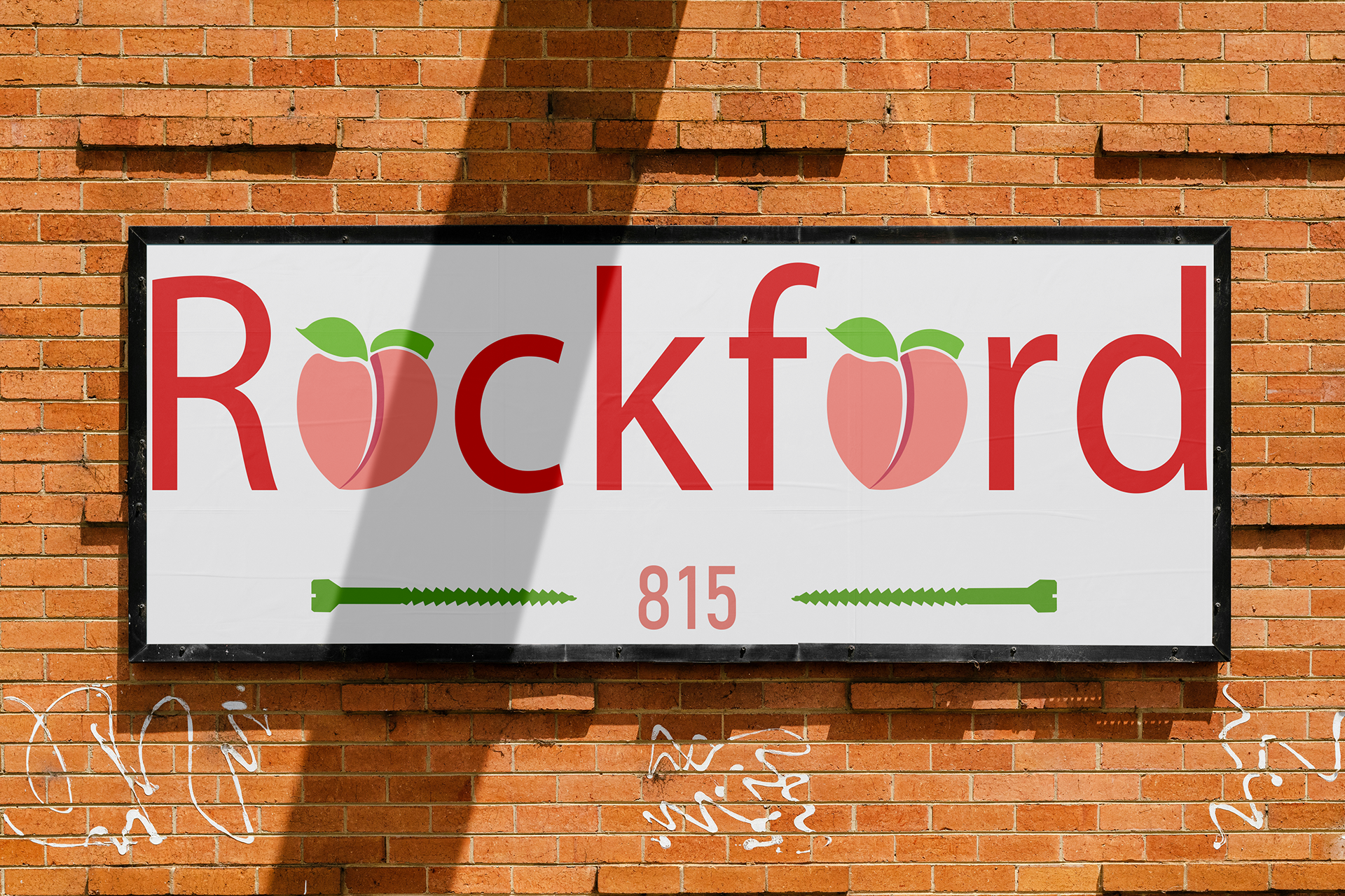
In the beginning of this project, I was struggling to relate to this location because I had no prior knowledge of it. But after a lot of secondary research, I gained more knowledge and elements to include in the Geographical Wordmark. The colors were a bit of a challenge deciding on what to include but I ultimately stuck to colors of the Rockford symbol and the Rockford Peaches baseball team. In the end, I was able to capture the organic, yet aesthetically pleasing, features in the color and design elements that signify Rockford, Illinois.